
Misleading bar and pie charts: How graphs can lead you astray
Cutting off the y-axis, using 3D effects and only showing part of the available data: these are all tactics to mislead people with graphs. But they don’t necessarily stay misled, the research shows.
‘You can easily mislead someone with a graph,’ says science communication researcher Winnifred Wijnker. ‘As a graph gives you a picture of the data at a glance – for instance, if one bar is higher than the other – people often don’t take the time to look at the graph properly. If a graph is not properly formatted, things can go wrong. And some graph makers take advantage of the fact that people don’t look properly.’
To see whether people who are misled by a graph can still be put on the right track, Wijnker carried out a study together with Ionica Smeets (Professor of Science Communication), Peter Burger (Centre for Linguistics) and Sanne Willems (Methodology and Statistics) into the effects of different correction methods. The study, entitled ‘Debunking strategies for misleading bar charts’, was published today in the Journal of Science Communication.
Four correction methods tested
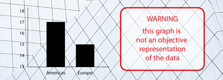
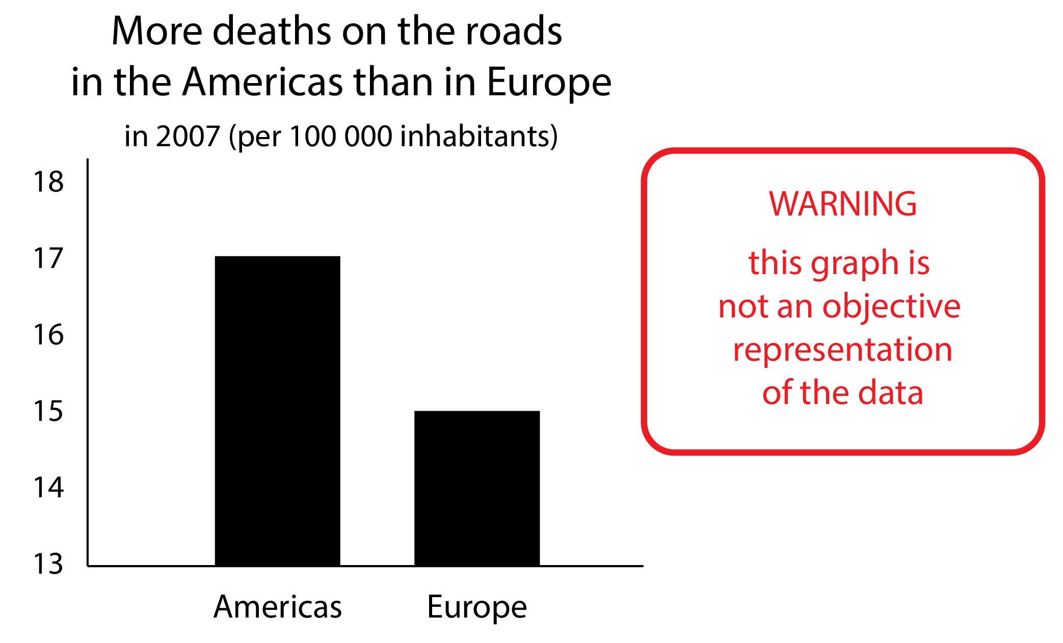
The research team tested four different correction methods for bar charts. This graph is common and easy to manipulate. The y-axis is often cut off, for instance, causing the zero line to be missing and the difference between the bars to appear much larger than it actually is (see GIF above). This was the focus of the study. In the first round, the participants were shown both accurate and misleading graphs and had to say each time how big they thought the difference was on a scale of very small to very big. After this round they were shown one of the four different correction methods and had to indicate again how big the difference was.
All the correction methods proved to help, with the participants finding the difference in the corrected graphs smaller than they had initially thought. The most effective correction method was the one that showed the misleading graph alongside the corrected one: the participants could compare them directly and see that the misleading graph had put them on the wrong track. With the other correction methods, only the misleading graph was shown with a visual or textual correction.
Click on the magnifying glass to see the correction methods in detail
-
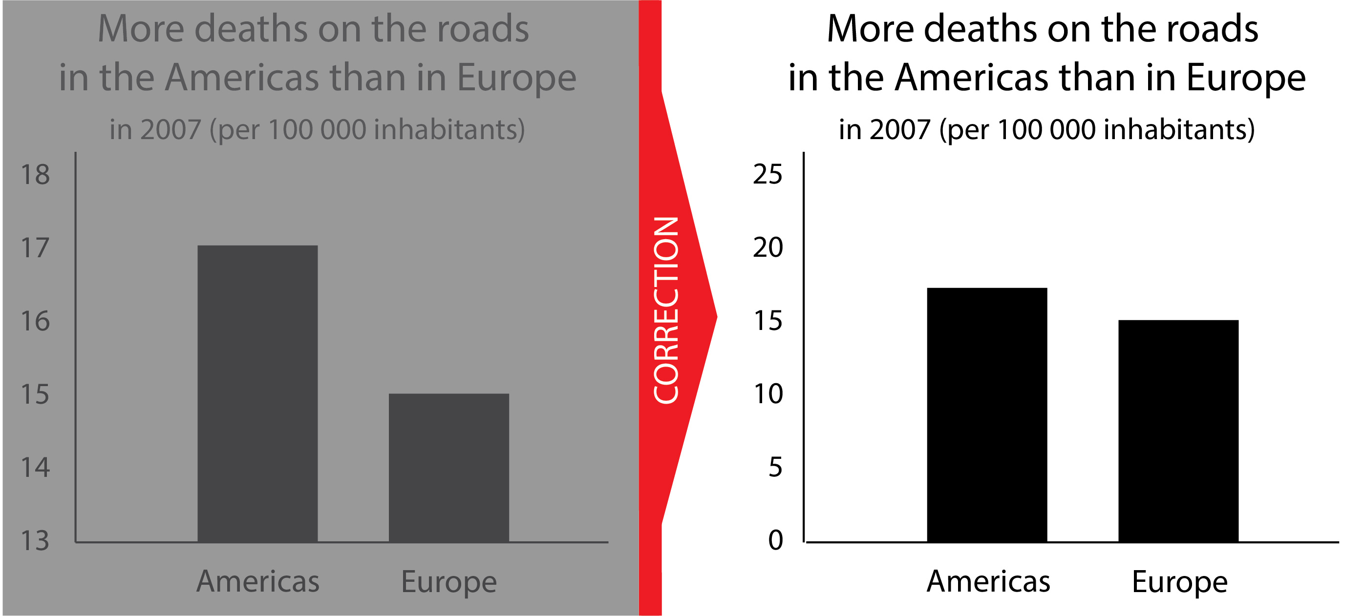
Correction method 1, the most effective correction method -
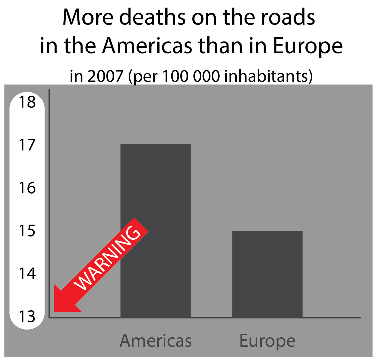
Correction method 2 -
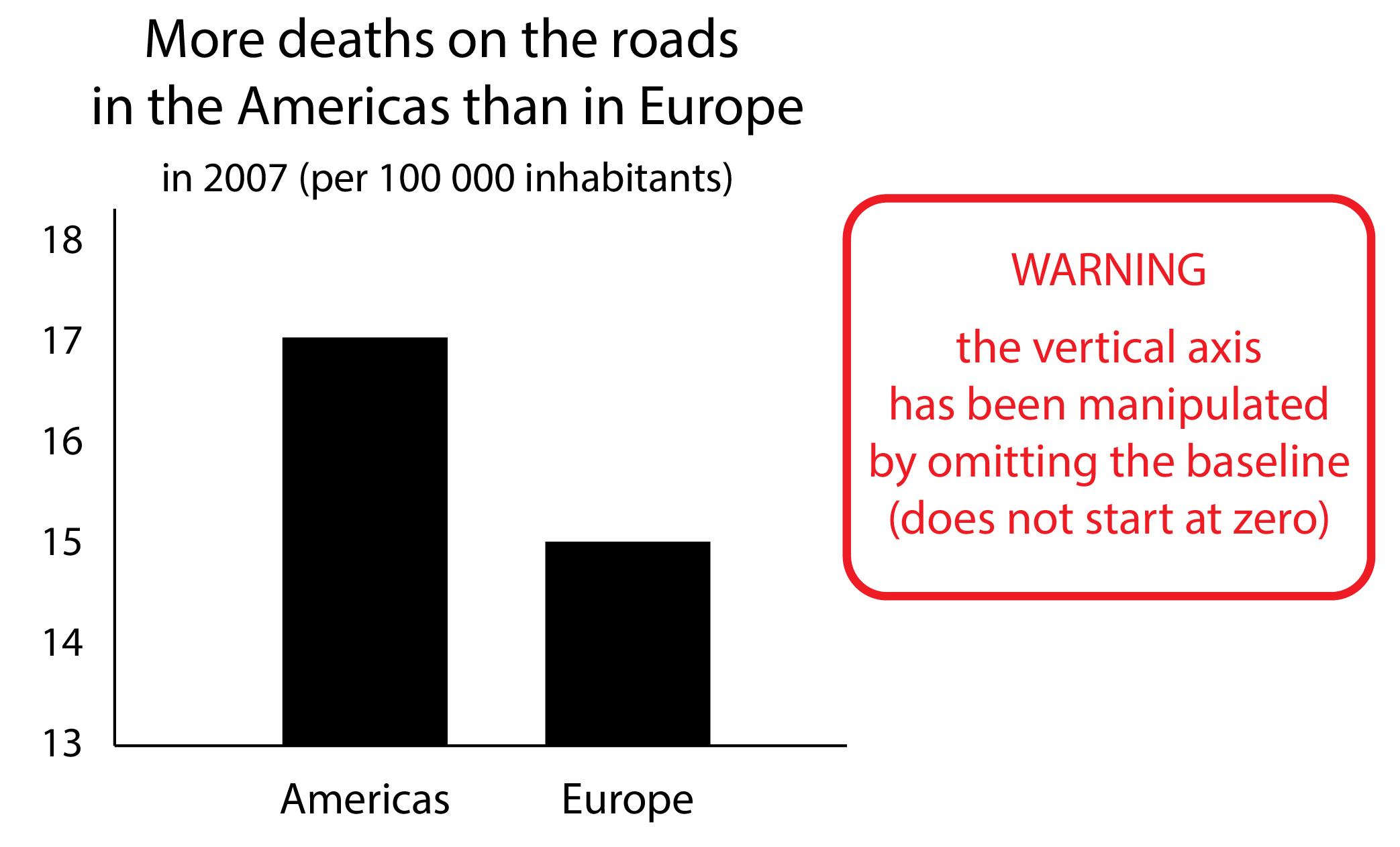
Correction method 3 -
Correction method 4
Follow-up research
The research team has since begun preparations for a follow-up study in which they want to improve the correction methods so that they also work for people with low ‘graph literacy’. They also want to make the graphs more realistic and test other types of graph, such as pie charts and area charts. ‘If a pie chart is shown in 3D, the front parts of the chart seem bigger than the back ones,’ says Wijnker. ‘And with an area chart, the figures on the graph are often – accidentally – shown much larger than they actually are.’
Grafiekpolitie
Wijnker and her colleagues also fact-check graphs, to give fact-checkers and readers tips on how to identify misleading graphs. ‘On Nieuwscheckers.nl, which Peter Burger helped set up, we are a kind of “graph police” that challenge graphs that aren’t correct. There is also a short checklist on Nieuwscheckers that helps identify the most frequently made errors in graphs.’
This research was made possible in part by the LUF Lustrum Grant, a grant of 150,000 euros from the Leiden University Fund.
Text: Sabine Waasdorp
Images: Winnifred Wijnker, Ionica Smeets, Peter Burger en Sanne Willems