House style
In its communications, Leiden University aims to create a clear and recognisable brand, which is why it is important that our house style is applied consistently.
Leiden University has a good reputation and a well-established brand, and it is considered to be a reliable partner. The house style helps us in communication with new and existing relations to create and reinforce our association with high quality and reliability. The basic elements of the house style are the logo, the house style colours and two fonts.
Logo
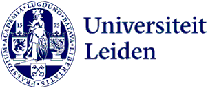
Our logo consists of a visual logo (seal) and a literal logo ‘Leiden University’. These two elements form a single unit and may not be used separately. The colour of the logo is blue (PMS 280). You should never reverse the colours of the visual logo: Minerva should always appear in white.
The logo with the Faculty name may be used on business cards, signposts and publications for internal use. Always use the official logos, which you can download from the online house style manual.
Colours
The primary house style colour is LEI blue (PMS 280). The house style also includes a number of secondary colours, which can be used to differentiate between faculties. Every faculty has its own colour, which is always combined with the house style blue. The secondary colours can be used freely to emphasize elements, for example in graphs.
Fonts
The University’s primary font is Minion (or Minion Pro). Minion is used for running text in publications, and in letters and reports. The University’s secondary font is Vestula. Vestula is used for headings (except on covers) and short texts.
Online house style manual
You can consult the online house style manual for more information about the basic elements of the house style and how to apply them in various communications. This is also where you can download logos and templates.
